What did I do wrong and how can I fix it? When an error is encountered during the use of software, this is what the user wants to know. Error messaging is an often-overlooked form of direct communication with the end user. It plays an essential and defining role in the user experience. User experience researchers for the Firefox team at Mozilla found that “[w]hen presented with the redesigned error message, we saw a 29 – 60% decrease in users stating they would attempt to access the website via another browser” (Walkington, 2019). In other words, error messaging can have a significant impact on user satisfaction and retention. Error messaging guidelines tend to be use case and industry-specific. In this post, I define a general-purpose goal to allow readers to reflect on the quality of their error messages in their own context.
Use error messages to capture the attention of end users
The purpose of an error message is to alert, inform, and guide end users. Effective error messages capture the attention of users. Laughery and Wogalter (2006) state that “color or other forms of contrast are associated with greater noticeability of warnings” and “red has been consistently found to have the highest hazard connotation.” Common tactics for alerting include the use of dialog boxes, status widgets, and prominent error log windows for graphical and textual user interfaces. Deliberate whitespace, capitalization, and execution summaries are used to alert from command-line interfaces. How do you know when an error message is doing its part to alert a user? The presence of the error should be unmistakable.
Categorize error messages into issues and resolutions
Attempt to bin the contents of an error message into either of the following categories: (a) information about the issue and (b) guidance towards resolution. To maintain a balance of brevity and clarity, evaluate the necessity of any content that doesn’t fall into either of those categories. When defining error messages, it is worthwhile to consider who will be responsible for resolving the error. For example, if you wrap an executable in a catch-all for any unanticipated exceptions, it is likely that the resolution of such exceptions is the responsibility of the team that wrote the software and not the user.
When resolution is an engineering task, provide information that will be useful to the team that will be debugging the software. Guide the user toward customer support so that they can get the assistance they need. Otherwise, state the explicit cause for the error and guide the user toward correct usage.
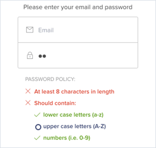
Dynamic password requirement widgets serve as an example of error messaging. They inform the user of unmet criteria and provide guidance to resolve the error state.

For subject matter that is difficult to condense, let the Microsoft Visual C++ (MSVC) compiler serve as an example. The MSVC compiler outputs a summary of errors at the end of execution with each error consisting of a severity level, error code, and short description. Each MSVC error code has a corresponding page on the Microsoft Docs website with an in-depth discussion of the issue, examples, and guidance such as further reading on the topic.
In summary:
- Error messaging is a form of direct communication with end users that has a significant impact on user satisfaction and retention.
- Being mindful of the purpose of error messaging—to alert, inform, and guide the end user—can improve user experience and aid in the support process.
- Traditional methods of alerting users (e.g., employing red font coloring) are backed by psychology and have consistently proven to be effective.
- Evaluate the necessity of error message contents that fail to inform or guide.
- For complex errors that require extended real estate, consider providing auxiliary reference pages for in-depth explanations and examples.
References
- Dickerson, S. S., & Kemeny, M. E. (2004). Acute Stressors and Cortisol Responses: A Theoretical Integration and Synthesis of Laboratory Research. Psychological Bulletin, 130(3), 355–391. https://doi.org/10.1037/0033-2909.130.3.355
- Laughery, K. R., & Wogalter, M. S. (2006). Designing Effective Warnings. Reviews of Human Factors and Ergonomics, 2(1), 241–271. https://doi.org/10.1177/1557234X0600200109
- Walkington, M. (2019). Designing Better Security Warnings [Blog post]. Retrieved from https://blog.mozilla.org/ux/2019/03/designing-better-security-warnings


1 thought on “How to guide end users with purposeful error messaging”
Remember to consider “status” messages too! I’ve learned many times over the years that users are happier when they have access to details about what the application is doing. Many years ago I was chatting with the CTO of a compiler company, and he mentioned that they had recently added new progress messages during compilation, and that their user community praised them for improving the compiler’s speed.